
Enactus SFU
Creating a design system from the ground up and designed the website UI.
As part of the global organization Enactus, Enactus SFU is committed to expanding sustainable projects each year, empowering students to develop entrepreneurial skills and become future leaders. Through its website, Enactus aims to raise awareness of its mission and attract sponsors to support students on their journey.To streamline design and development, I created a comprehensive design system. I also collaborated with another UI designer to design the website’s user interface.
01
Overview
Role
UI Designer
Contribution
Design Systems, UI Design
Tools
Figma
Duration
August 2024 - October 2024
Final Website
02

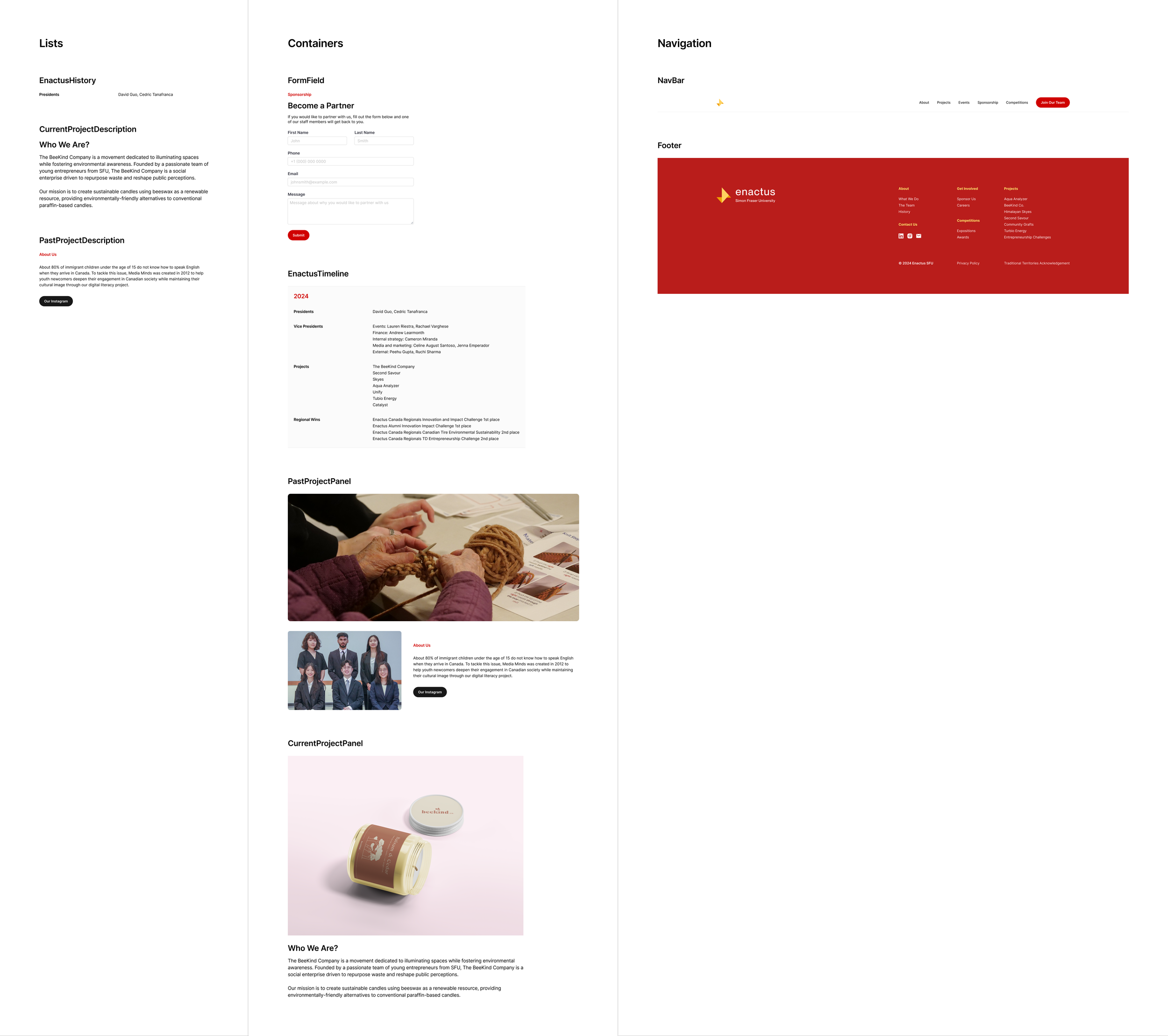
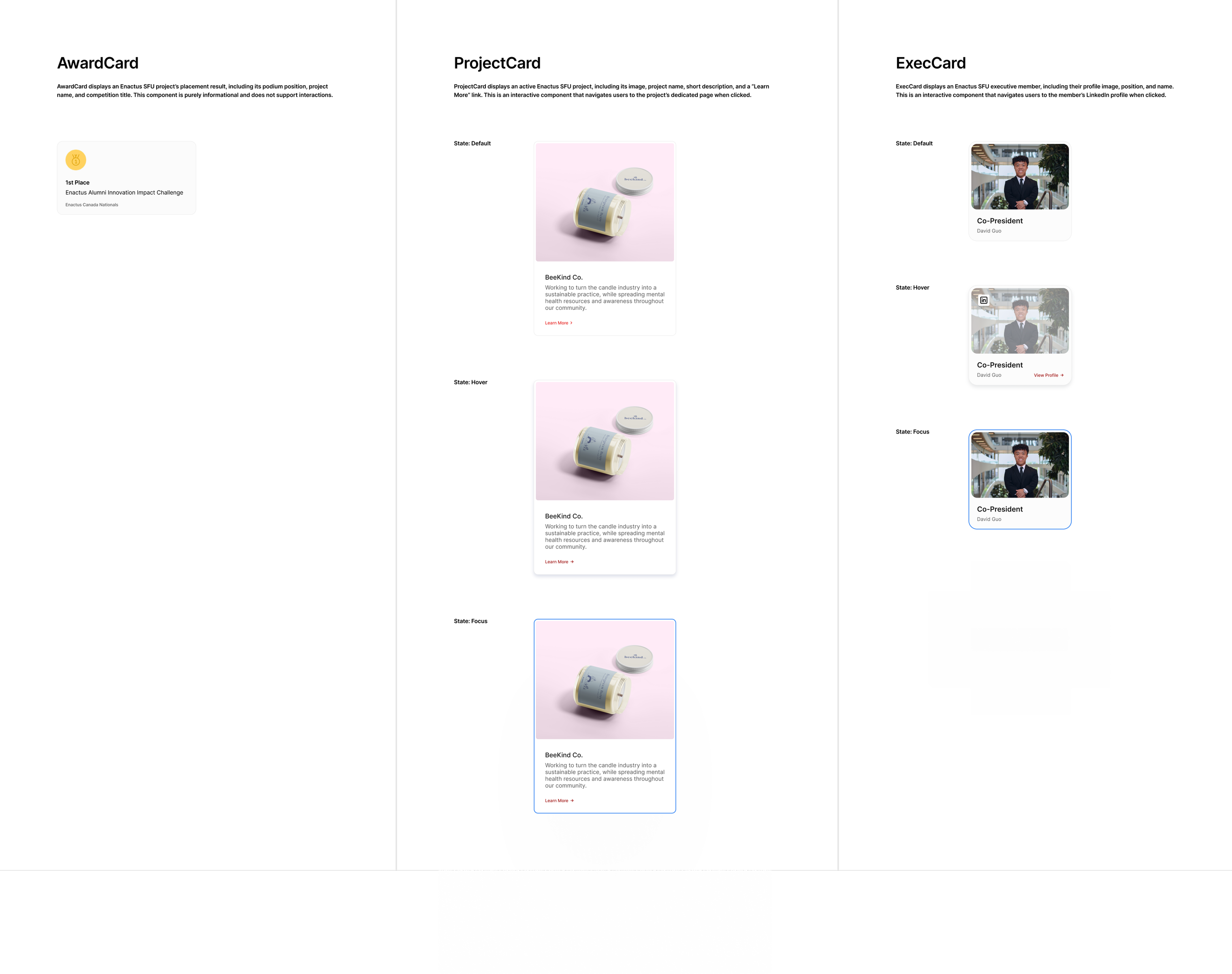
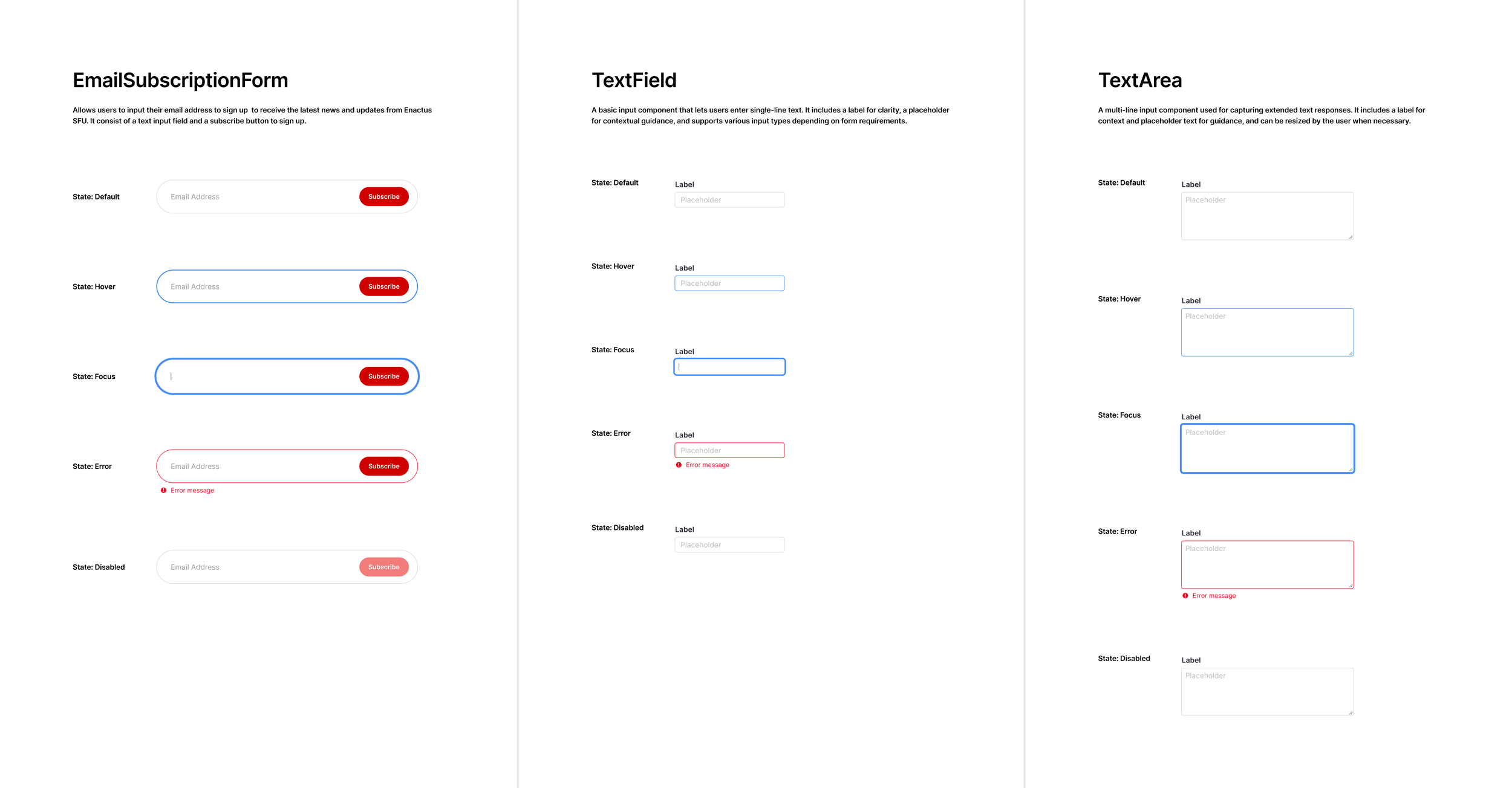
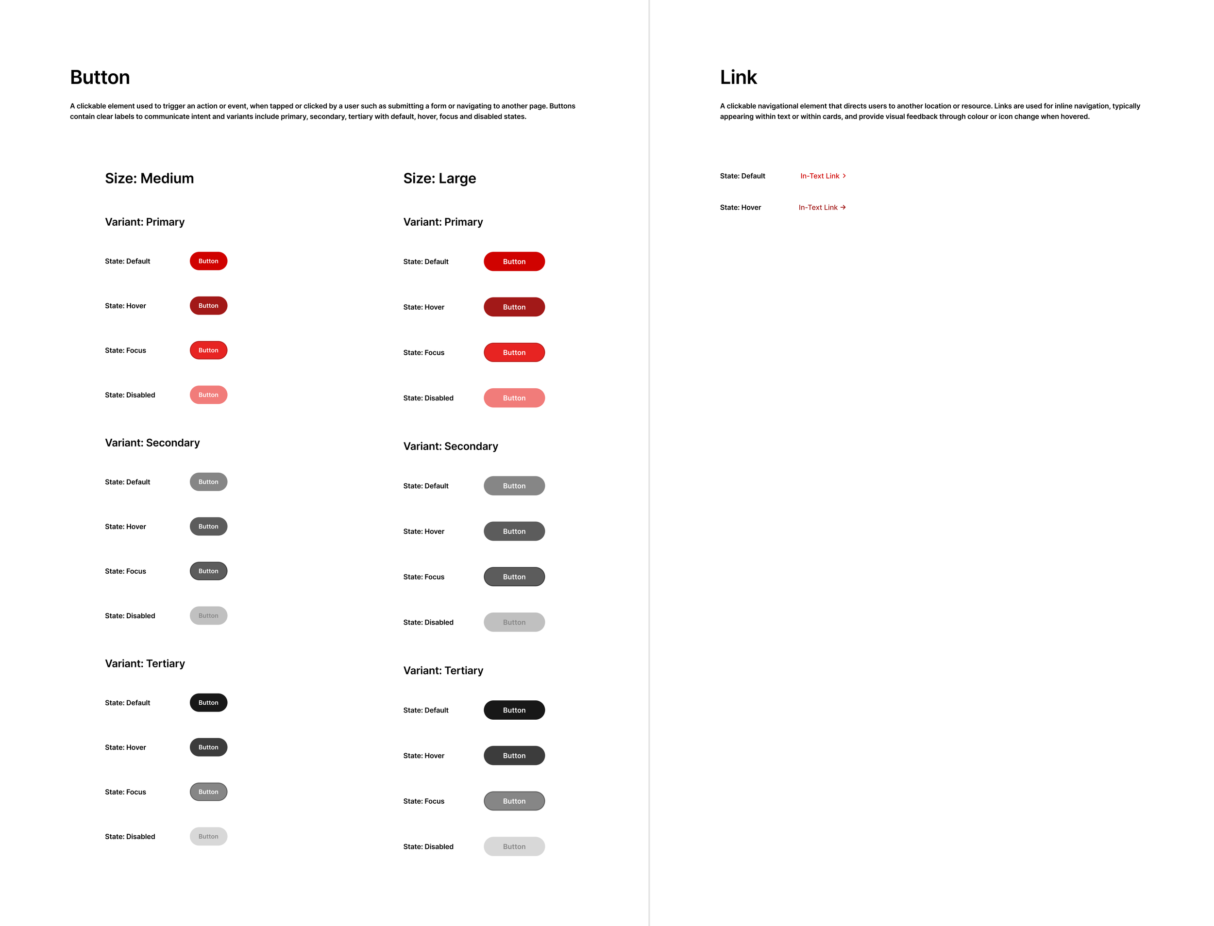
Components Overview
03
Foundations
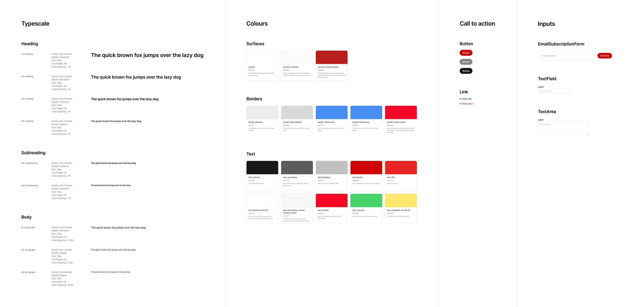
Foundations
Communication
Inputs
CTA
Through this project, I learned that maintaining a design system is more challenging than it appears. What I designed in Figma didn’t always translate directly into development, which made me realize the importance of proper documentation and collaboration with developers. I found that developers may interpret design components differently, so having clear communication—and some understanding of web and app development—helps bridge that gap. This experience also emphasized the need for quality assurance to ensure the final product reflects the intended design. Overall, it taught me that building a design system isn’t just about consistency in visuals, but also in process, communication, and implementation.